In the article “The Power of Infographics”, we showed that infographics are excellent and versatile tools for medical affairs teams because they get to the point, spark conversation, and help you reach more people in your target audience.
In this article, we give the 7 key ingredients for infographics with the power to educate HCPs and your medical affairs team while giving them a lasting impression of the story behind your data.
![]() 1. Be relevant: STORY
1. Be relevant: STORY
The US graphic designer and Professor at Yale University Edward R Tufte once said: “Design cannot rescue failed content.” The same is true for infographics. Before you begin, the message you want to convey must be clear. What do you want to show and why? What facts support the message? Size, format, design, and style are all secondary to these questions. In other words, you can’t have a good infographic without a good story.
Start with your audience: who are they? What do they know, think, and feel before they see your infographic? What do you want them to know, think, and feel after they see your infographic? And most importantly: if your audience only remembers one main idea after seeing your infographic, what should it be?
![]() 2. Set the stage: SIZE & FORMAT
2. Set the stage: SIZE & FORMAT
In theory, infographics can be produced in any size and format imaginable: from large to small, portrait to landscape, round to square – the possibilities are endless.
However, in practice, a few sizes and formats are used more frequently:
One-pager: usually A4 or US letter format; mostly portrait orientation; ideal for print- and digital use
Posters: usually A3 and ANSI C format; portrait or landscape orientation; ideal for print use
Slides: usually 16:9 (sometimes 4:3); landscape orientation; ideal for use in PowerPoint or Keynote presentations
Special: flexible formats in portrait or landscape orientation; ideal for use in responsive software and on mobile devices
![]() 3. Define the look and feel: DESIGN & LAYOUT
3. Define the look and feel: DESIGN & LAYOUT
Infographics are characterized by thoughtful design, the making of which should not be put on the back burner. Otherwise, the infographic will look uninspired, inconsistent, and cobbled together.
Ask yourself: how can you visually support messages? How can you elegantly combine images and text? How can you incorporate shapes and colors? By addressing questions like these, you can create something truly unique that won’t get lost in the shuffle.
So establishing design rules early on will help shape the infographic and improve the overall look and feel.
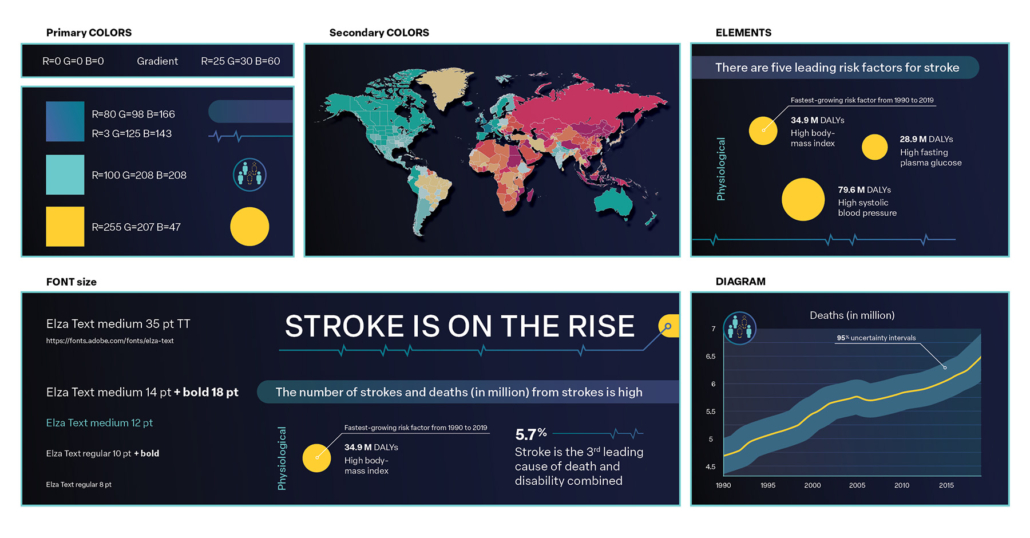
For example, you should specify:
- design elements (shapes, lines),
- color palette, and
- font and font sizes.
You can also add a special touch by choosing an overarching design motif, such as a circle or hexagon, which will then appear again and again, sometimes only subtly. For all of this, logos, company websites, and product or brand guidelines can be valuable sources of inspiration.
Overview with key elements
One aspect that is closely related to design is layout. Layout is the overall arrangement of all elements of the infographic, which includes the design elements, but also visuals, charts, and text. The communication goals, the rules of graphic design, but also culture and psychology influence the layout. While design decisions should be considered a ‘day one issue’, layout decisions are not as critical and may be revised throughout the development process.
![]() 4. Show, don’t tell: VISUALS
4. Show, don’t tell: VISUALS
Visuals are important parts of any infographic. They speak to our ancestral visual brain and help making abstract concepts or ideas tangible. For example, they can evoke emotions, show complex interactions, or serve as visual shortcuts rather than detailed depictions.
Visuals include photos and illustrations. They have certain advantages and disadvantages.
If available, photos can be a cost-effective and easy-to-implement option. However, you may not be able to edit the photos enough to meet the intended communication goal, they may be copyrighted, or they may not be of the required quality. Also, if no photos are available, the time spent searching for suitable photos may exceed the time needed to create an illustration.
Illustrations can be created in virtually any style and sophistication, from icons to line drawing, from stylized to natural 2D illustration, from abstract to realistic 3D renderings. In addition, the level of detail and complexity of the style can be customized depending on the time and budget available.
What visual approach is the right choice? It really comes down to where and how visuals can add the most value to your message.
![]() 5. Captivate the reader: the KEY VISUAL
5. Captivate the reader: the KEY VISUAL
A key visual is an element to anchor or hook the eye, something that stands out and captures the reader’s attention. The key visual introduces the topic of the infographic. Along with the headline, the key visual is also the starting point from where the reader keeps exploring.
In essence, a key visual should be:
- captivating,
- relevant and relatable for the target audience, and
- easily understandable.
Key visual of the infographic
![]() 6. Establish credibility: CHARTS, TABLES & GRAPHS
6. Establish credibility: CHARTS, TABLES & GRAPHS
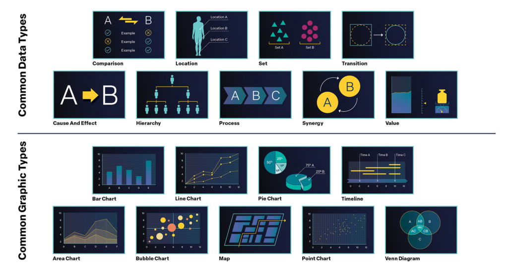
In addition to visuals, charts, tables, and graphs also play a major role in infographics. They help extract, contextualize, and interpret data and identify patterns, trends, and outliers. To transform data (e.g., numbers, values, sets) into meaningful charts, one needs to first identify the data type, and then find the most appropriate graphic type.
The data type drives the choice of graphic type, not vice versa. For example:
- Kaplan-Meier curves for showing survival rates.
- Timelines for visualizing a study design.
- Maps for comparing data across countries or cities.
- Pie charts for epidemiological data showing patient subsets.
- Bar charts to capture differences in QoL survey results.
At any point, the choice of graphic type must be carefully reviewed and questioned, as ambiguously presented data can easily lead to misinterpretations, misunderstandings, and errors–an unfortunately common problem, as shockingly demonstrated by media releases during the Corona pandemic.
Common data types and graphic types
Interestingly, people often intuitively choose appropriate graphic types. For example, which graphic types come to your mind when you think of the following information?
- The flow of a clinical trial, including the important treatment dates or timepoints of physiological assessments.
- The location of the centers where the trial is being conducted.
- The overlap between certain participant characteristics
See the answers here
(a) timeline,
(b) map,
(c) Venn diagram
![]() 7. Keep it short, simple, and logical: the TEXT
7. Keep it short, simple, and logical: the TEXT
Text is an integral ingredient of any infographic. Text provides background, gives explanations, or points out key messages. But you don’t want your readers to dig through unfamiliar words, technical terms, and tons of abbreviations, and risk that they lose interest, get frustrated or even annoyed. You want your readers to receive the information as fast and easy as possible: plain words and simple syntax do this best!
In essence:
- Use words your readers are likely to understand (e.g., “use” vs. “make use of”).
- Use only as many words as you really need (e.g., “can” or “may” vs. “has the potential to”).
- Be consistent (e.g., do not use “death rate” in one instance and “mortality rate” in the other).
- Use active voice when possible (e.g., “the skull protects the brain” vs. “the brain is protected by the skull”).
However, still try to maintain a language level that is appropriate for your target audience and reflects their level of knowledge and educational background. “Blood-forming cells” may be appropriate for a lay audience, but it could strike a hematologist as imprecise: do you mean “progenitor cells” or “hematopoietic stem cells”? Another important point is that not all text is the same: structuring the information in the form of titles (or headings), subtitles (or subheadings), body copy, captions, and labels is crucial for readability and comprehension.
In practice, this can be achieved through different font sizes and font styles. If you wish to highlight certain passages, you may want to highlight sentences or words, for example with color or varying font size.
Now that you know the key ingredients, you can start cooking up your own compelling infographic!


